Archive for category Strickly Speaking

Baroque and Sinister Diagonals

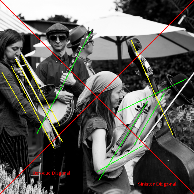
Diagonals © Knut Skjærven.

Diagonals © Knut Skjærven.

I had a challenge understanding why some images visually held together even if the content was rather complex and varied.

So with this image. I knew that I liked it, but that was more of a spontanesous reaction than anything else. Something had drawn me to this scene when I was there. And why did I crop it this way? I wanted to know why.

I had to study it more closely and it was then that I found that the line structure had a certain pattern: There was a seemingly extensive use of almost parallels to the two diagonals. I had been enhancing the movements in the shot by stressing the diagonal patterns.

I remember that the main diagonals had specific names. I now wanted to find out more since this was obviously something I could use.

I had not taken that much notice of these things earlier since I found it, primary, an area for painters and people who were into drawing. Some would say, for proper artists. That was about to change.

The diagonal moving from the upper left corner to the lower right corner is named The Sinister Diagonal. The other one is The Baroque Diagonal. I wanted to learn not only the  functions, but their names too.

There are even psychological implications inherent in both. The Baroque Diagonal is the positive, the engaging, the optimistic one. The Sinister Diagonal is the more gloomy, end of the party, go back home type of message. Some say that is the message they carry.

These things have, in my humble opinion, to be taken with a grain of salt since such inherent qualities have to be balanced with a variety of other influences. But I was, indeed, ready to listen.

You may ask why I would want to know and internalize strange words like baroque and sinister and put them to use in a context like this. And why should YOU know them? Two reasons for that.

The first one is that I believe that having a proper and relevant language opens new dimensions of perception. If you don’t know the words, you don’t see the herds.

The second reason is that it makes communication much more easy and efficient. I can now verbally point to a dimension within this picture, and within all others like it, that people will understand without much efforts. I could say, for instance, that the image above is held together by repetitive use of baroque and/or sinister movements. And you will immediately know what I am talking about.  That are the reasons why.

No more words. The idea with this post was to point to the two diagonals and to highlight the two names: baroque and sinister. And to point to their supporting cousins: The green lines in the photo supporting the baroque movement, the yellow lines supporting the sinister movement.

For those you find these speculations interesting, let me refer you to two great sites. The first one being The Barnstone Studios, the second one being Adam Marelli Photo. These are eminent sources. You will find much more information on these sites.

Good luck with it.

© Knut Skjærven. All rights reserved: Text and picture.

January 5, 2013.

, , , ,

9 Comments

Rule Of Thirds

Missing The Point © Knut Skjærven.

Missing The Point © Knut Skjærven.

This is what John Thomas Smith said in 1797:

In applying this invention, generally speaking, to any other case, whether of light, shade, form, or color, I have found the ratio of about two thirds to one third, or of one to two, a much better and more harmonizing proportion, than the precise formal half ….

You will be amazed, as I just was, to see how many of your own images that you like, for one reason or other, actually fit the formula that John Thomas Smith called the Rule of Thirds.

It is Friday and it is 04.00 p.m. so I am not going to say much more other than that this brief post is to trailer a new section in Street Photographer’s Toolbox. It will evolve over the next months. All posts will be linked to and found in a new blogroll section named Strictly Speaking.

It has to do with classical rules for visual compositions. And there are lots of them.

In Street Photographer’s Toolbox it will be ONE orientation to street photography among many others. You need to know what these rules are all about to know when to use them and when not to use them. That is the very simple core of the argument.

The new section will spin off quite a few posts INCLUDING several drilling sessions that you can engage in.

Your question to this new section could be, as is was for me: It this not merely nostalgia we deal with when we talk about composition in this strict sense? I would say, no it is not, even if I to a certain degree believed so.

Missing The Point, the image above, was actually chosen to argue that it did not comply with any of the classical rules that I knew of.  I looked for eye contact and found that there weren’t any at all. (The crossing points between horizontal and vertical lines are called eyes and there are four of them.)

That was until I discovered that the hefty parts of the image, with the close up dancers, filled about two thirds of the image. I got wiser.

Stay tuned. This is going to be a very interesting section. I will for me, anyway. I am going to learn a lot.

Have a good weekend.

© Knut Skjærven. All rights reserved: Text and Picture.

January 4, 2013.

Let me remind you of  The Workshop to be held in Berlin June 20 – 23, 2013. 
, ,

3 Comments